Friday, December 30, 2016

Making Better Museum Video with YouTube Data

I presented evaluation methods for YouTube as a part of a collaborative panel presented by the Media Production and Branding Special Interest Group and the Data & Insights Special Interest Group at MCN 2016 in New Orleans. The panel featured evaluation methods research by Trilce Navarrete and Elena Villaespesa, and a case study of SFMOMA video strategies by Emily Robbins. I am finally posting an unpacking of my portion of the presentation and outline some of the next steps for my YouTube video research that was inspired by a presentation by Emily at Museums and the Web 2015.

The tool

I can't take credit for this brilliant tool created by Digital Methods, but it is an awesome resource and organization. They have a collection of wonderful tools, the one I am using is the YouTube data scraper:
Screenshot of digital methods interface.

https://tools.digitalmethods.net/netvizz/youtube/mod_videos_list.php

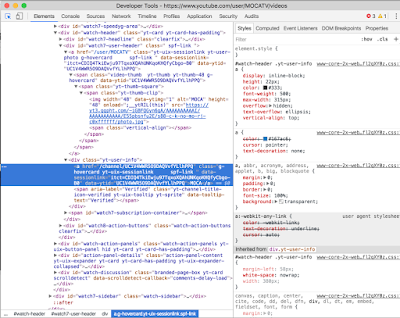
Using the channel id approach I can scrape the full list of every publicly posted video on a single channel. Then I use chrome developer tools to grab the channel id from the code side by selecting the channel name and locating the  "data-ytid" field. Below is a screenshot that shows this.

YouTube screenshot demonstrating where to place developer tool to get channel ID code.Screenshot of developer tools window showing the field highlighted.


So what channels do I pull data from? In other words, who do I benchmark against? I look at institutions I consider peers to my own. So not only a similar range of content being presented but also a similar budget. In addition to contemporary art museums of a similar size I like to also include what I call aspirational channels. For me this is the Louisiana Channel whose rate of production is beyond anything we could reasonably take on at the MCA, but I love their productions and their channel's high performance reflects that quality.

The data

Once the data is scraped I pulled it into Tableau taking the entire data set by video title and pulling that into the graph and looking at measurable elements such as Duration versus view count with the channel titles sorted by color so that I could identify the densities. Hooray for data visualization!

Tableau screenshot showing views mapped against duration for Hammer Museum, Louisiana Channel, MOCA, Museum of Contemporary Art, Stedelijk, Walker, and Yerba Buena

This map looks at the view count against the date published so that you can see when channels are born and who is doing burst publishing, many videos at time in little bursts as opposed to with regularity over time. In this you can see exactly when MOCA TV was in full swing, particularly the launch, where you see the highest density of publishing.

Tableau screenshot showing views mapped against release date for Hammer Museum, Louisiana Channel, MOCA, Museum of Contemporary Art, Stedelijk, Walker, and Yerba Buena. We see clumps of when popular channels came into existence, like MOCATV during 2013-late 2014.

For kicks I switched view count to like count, and as I presumed likes directly reflect views but with lower numbers so let's just ignore that and look at views where we get numbers that make us feel a little more relevant. Because, as you'll note even in the above graph I capped it at 25k because let's get real, museum video is only so popular as a thing.

Tableau screenshot showing likes mapped against release date for Hammer Museum, Louisiana Channel, MOCA, Museum of Contemporary Art, Stedelijk, Walker, and Yerba Buena. We see clumps of when popular channels came into existence, like MOCATV during 2013-late 2014.

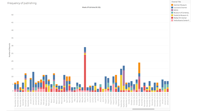
A question that came up from the group when I started sharing my graphs was how often are people publishing content? So This stacked bar graph became a really interesting tool for examining bursts of activity and who is creating at regular patterns, and here we see that the Louisiana Channel's consistency is incredibly impressive. And something happened the week of May 31 at the Walker in 2015, and yes I remembered exactly what it was, the Superscript conference had just happened it was the mass upload of all the symposium content so we'll see a similar burst of activity like this for last week as they just posted their Avant Museology symposium documentation.
Tableau screenshot showing number of releases mapped against release date for Hammer Museum, Louisiana Channel, MOCA, Museum of Contemporary Art, Stedelijk, Walker, and Yerba Buena.

Learnings

Looking at the data I am getting some ideas about good practices, not necessarily best, about what makes video work well. Frequency of posts and short durations certainly seem like important aspects of the content. The data also demonstrates that there are exceptions to every rule. And finally, an easy win if popularity is your goal–Celebrities! 

So how am I applying these learnings if my goal is to get more views and followers?
First what are we making and how is it doing? Our production methods to date have quite simply been to capture more program content and create better and more produced content, the edited narratives that accompany exhibitions.

New practices

Post video clips (outtakes)
Timely release of content
Prototype informal content capture that would be long term sustainable for the scale of our production team.

Wait, is the goal reasonable?

This goal directly conflicts with our distribution method. We embed from Vimeo on our website which is our primary traffic destination from social, so I am not getting any of the Vimeo stats incorporated into our performance. I'll never be the Louisiana channel with that kind of distribution method. So how do I prepare our channel for a future where it is better integrated into a new digital strategy? Or do I let go of my YouTube obsession and embrace alternative distribution strategies and instead focus on the aggregation of the analytics across these media. Perhaps, but I am a huge YouTube fan, and I love the idea of our museum videos being integrated into the fabric of the diverse world of YouTube content, MOCA TV did get that right for a little while. So can we be players in this game and end up a part of someone's YouTube K-hole? Maybe someone discovers contemporary art one long night of clicking.

Next steps


Fill out this survey to participate in the conversation (even if it is months later, the data is still useful). The answers to these questions help the team that worked on the presentation all of this was a part of continue to develop tools to benefit our work.

Create a museum video data exchange. The scraper tool only gets the surface level information, number of views, duration, etc., not the level of detail we can get on our backend analytics. But we can start exchanging CSV files from our channels to compare analytics. Maybe even create a museum video data repository so that we can start being a smart as Netflix and redesigning our content based on how people are engaging. Or maybe not since we can barely keep up with content production, but you get the idea.

In context of the insights we gain, look again at how the mainstream is functioning– there is plenty of information out there, for example– http://tubularinsights.com/youtube-statistics-competition/

Figure out a free way to aggregate data across our platforms, e.g. YouTube and Vimeo. Surely there are services that can do it, but let's roll up our sleeves and figure it out!

Continue to use the MCN network to develop a toolkit for understanding engagement with our video content across platforms.

Start gathering more detailed evaluative data on our video. We do user testing for websites and interactives, why not the video itself? Can we get as clever as Netflix in the creation of our content, where we shape the methods and styles to improve our approach to sustainable content creation?

What makes a good video?

Friday, July 22, 2016

The Brand Master Series for MCN Pro

Check out two conversations with brilliant women working with brands from strategy to design. They help us to think about what brand means from content to finished project. In addition to talking about the idea of branding each presented a variety of selected projects to give us a window into how they approach brand for various types of clients.


Sunday, November 15, 2015

Why have museum brands become commodities?


Recently two major art museums in America presented their new and exciting visual identities: SFMOMA, under a major renovation (re-opening day as May 14, 2016) and the Museum of Contemporary Art Chicago. Both projects bring a lot of buzz for the museum sector and, at the same time, reminds us of the challenges from the standpoint of strategic brand management. 

As a design project, the SFMOMA is great. A coherent change for a 20 year old logo. Fit for an open platform approach, is best used when it’s in the “expanded” version that pushes the three parts of the logo to the edges of any layout. And yet you can also relate it to the "frame" graphic trend that envelopes whatever is inside.

"Just as our new building is much more open to the city, the new logo is deliberately porous, providing multiple points of access. The organic configuration of the three parts echoes the idiosyncratic, free-thinking culture of the Bay Area, which is known for its nonconformity and diversity", said the SFMOMA in-house design team, "In short, the logo is designed to be as versatile and dynamic as the program of the institution".

The same could be said about the brand new MCA Chicago new identity, a powerful typography and grid oriented design, from Mevis & Van Deursen studio. It's a game that opens up a conversation (with a friendly HI and GO upfront) and also keeps a direct relationship with the contemporary art they display. As posted of the new museum website: "The identity features a grid, which refers both to the city grid of Chicago and the limestone and cast-aluminum squares that form the facade of the MCA; a color palette of black, white, yellow, and blue; and a new logo. Keeping the concept of a grid in mind, French designer Karl Nawrot created the typefaces by combining squares to form a series of fonts that range from playful to classical and evoke our institutional values and our diverse programs".

Both projects are just a starting point. The institutional practice will show if all the associated metaphors will come to life or if they are just visually cool. Considering the museum's recent history, there is a lot to expect.


And that always makes me think how much we, in the museum business, are aware of creating create sleek, unique, even name-free logos that are still instantly recognizable. And more: that not only "evoke" or represent the values and dynamics but also push those institutions forward. In Dec 2014, Damian Borchok, CEO of the Interbrand Australia, presented the talk I have nothing to say, and I'm saying it on the Communicating the Museum conference. Check the video where Borchok argues that contemporary brands, whether in retail or culture, ended up falling into the trap of becoming "commodities". 

That’s a good point to discuss. Cultural organizations have gradually adopted a series of those market conventions where the visual dominance in any medium should only be attributed to the content. The museum that is presenting should be hidden - except for the presence of that little logo on the corner that your boss always asks you to make bigger. But size is not the matter. That means a missed opportunity to show the connection the organization have to content. The logo is there but it do not speak out. In most cases you can easily swap the logo from an institution to another and that could give the same result. You won’t even notice it.


This is especially true for cultural organizations that have done branding programs following a design trend type that does not necessarily reflect something of the nature of these organizations, their views or the causes they support.

To Borchok, the way of building strong brands in museums begins by having something to say and actually saying it ("put on display").
What are your thoughts about this? Has your museum brand also fallen in the same trap? How does the print and digital work you do for your museum authentically speak up in context of the organization's mission?

Saturday, October 17, 2015

Make your own Big Ideas video

The short videos circulating on the MCN Twitter feed were produced using the following remote capture method. We're sharing this tutorial and tips to encourage more presenters to take on creating self produced videos telling us about your session at MCN in November. If you do, be sure to tweet it to @museumcn!


Remote interview capture for Mac users 


1. Smartphone/iPhone capture. Built-in video recording software is great, to improve quality look at the lighting and sound tips.

2. Recording with a Mac with iSight:


  • Open Quicktime Player
  • File > New Movie Recording
  • To select external camera or microphone click arrow next to record button to change settings
  • When ready click record in Quicktime
  • Once the file opens make sure to save it!


  • 3. There some good free software and tutorials for PC recording out there as well, just not tried and tested by us so not sure which are the best. If you know one, please share in the comments!

    Lighting tips


    Set up so that you are not in front of a window, instead face the window for full, even lighting.

    Turn down brightness on laptop and turn on a desk lamp to avoid the blue glow of the screen.

    If there is a little bit of a color cast over the image, this can be fixed by working with more even colored lighting; using just daylight, or just incandescent artificial light.


    Sound tips


  • Use external microphone: An external mic is always better, if you can borrow one, even a low-end microphone will help reduce ambient sound. If you have a newer laptop with one “headphone jack” for sound you can use an iphone style headset with a speaker to get more isolated sound.
  • Sound Check: Test out your set up first by doing a test recording, make sure your setting is to “Built-in input.” If your clip doesn’t have any sound proceed with using the built in mic on the computer.
  • Reduce ambient Sound: It is important is to record in a quiet place, so close the windows, turn off fans, children and refridgerators. Play back your test recording at high volume and listen closely for background noises that you can fix.


  • If you want to buy a microphone because you have now become obsessed with making your own vlogs these are all going to be a step up from a built in laptop mic:
    • Cheap ($16):Cyber Acoustics CVL-1084 USB Desktop Microphone
    • Better ($40):Samson Go Mic - USB Microphone for Mac and PC Computers (Silver)
    • Way better ($55): Blue Snowball USB Condenser Microphone with Accessory Pack (White)
    • Awesome ($160): Rode NT-USB USB Microphone

    Saturday, September 26, 2015

    UPDATE

    This blog was created to provide a space to informally share ideas and projects with the museum video production community. We can’t say we have sustained the initial excitement: we had 26 posts in 2013; 4 posts in 2014 and none so far this year. Most of the posts with no comments at all. But hey, see how we care about metrics and evaluation?

    Maybe it’s the right time for you and me to give the blog a second chance. With the freshly rebranded Media Production and Branding SIG and the Educational and Interpretive Media SIG it’s the perfect time for a reboot. (Side note: be sure to get yourself officially included in the SIG by signing up via the form link on the above linked SIG page that you want to be involved in)

    Personally, we are excited about this change and look forward to seeing how this fosters expanded conversations about the media production process in context of the institution and its story (MPB) or the context of interpretive and educational tools found within and beyond the gallery (EIM). We also look forward to the inevitable collaborative opportunities we will have with one another as well as with other groups like Metrics and Evaluation. I look forward to hearing your ideas for collaboration and discussion topics here on the blog and at our upcoming annual meeting, more on that soon!

    The official communications for the MCN Special Interest Group on Media Production and Branding will (like all the others) continue on the MCN list-serv. This blog is an informal place for capturing our conversations that can be easily shared throughout the community. So we look forward to continuing to hear about projects, technologies and provocations about the production of media content for museums here, but it’s only gonna be fun if you're here.

    I am working on a post about the real scriptwriting process, not the idealized one we reference when describing our production process at conferences. And Luis is working on some interesting stuff about branding to get the conversation going on this new aspect to our group.

    It’s gonna be FANTASTIC.

    Let’s rock and roll.

    Thursday, September 18, 2014

    September MCN Pro Session


    This past week Emily and I brought together some wonderfully smart people to talk through file organization and the specific challenges we have when working with audio and video media. I learned so much from our guest presenters, and I look forward to incorporating tools and techniques from their presentations into my workflow.

    Session Description: Have you ever gotten tangled in a web of disorganized video and image files? What are the best practices for organizing and storing images, audio and video? What is the difference between interpretive content and collections content? What constitutes a work of art and a backup work of art when discussing file types?

    Anna Chiaretta-Lavatelli and Emily Lytle-Painter, co-chairs of MCN’s Media Production SIG, will explore issues around digital file storage and organization in cultural organizations with the follow speakers:

    Heidi Quicksilver, The Jewish Museum
    Crystal Sanchez, Smithsonian Institution
    Patrick Heilman, DIA Art Foundation

    This is an informal “radio show” style chat with short “presentations” and Q&A.

    Monday, April 28, 2014

    MCN2014 Proposal: Iron Editor

    Here is a potentially fun/ridiculous idea for a panel:

    A group of video editors are given a shared set of assets and a few different challenges (no animation, use only still images, same b-roll from an iPhone, keep it under 1:00, use only creative commons licensed materials for anything additional, etc). Those editors sit in a public location (maybe in the conference room) and have their screens projected while they edit for an hour (?) prior to the session presentations, (perhaps with a moderator providing Iron Chef style play-by-play?). The participants then discuss their thoughts in general about editing and storytelling, and the works are presented, questions are answered.

    Anyone game for being a part of it? It would all be in the spirit of fun and not harshing judging your chops. I'd down to be a moderator, announcer, or editor and hand over the reins to anyone.